Welcome to image alignment! The best way to demonstrate the ebb and flow of the various image positioning options is to nestle them snuggly among an ocean of words. Grab a paddle and let’s get started.

The image above happens to be centered.

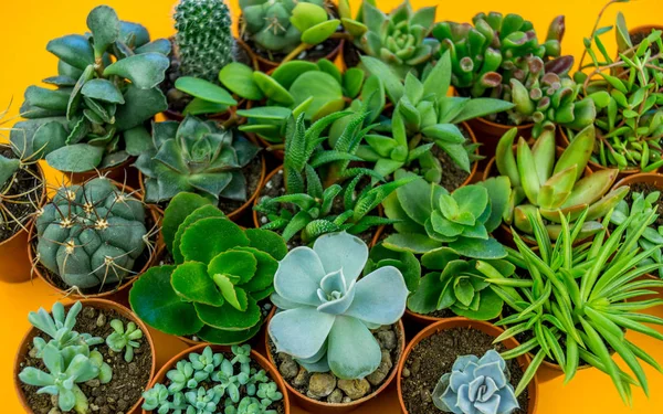
The rest of this paragraph is filler for the sake of seeing the text wrap around the 150×150 image, which is left aligned. As you can see there should be some space above, below, and to the right of the image. The text should not be creeping on the image. Creeping is just not right. Images need breathing room too. Let them speak like you words. Let them do their jobs without any hassle from the text. This arrangement creates a visually pleasing layout. Maintaining proper spacing ensures clarity and professionalism in design. When text and images harmonize, the overall message becomes more impactful. In about one more sentence here, we’ll see that the text moves from the right of the image down below the image in a seamless transition. This balance between text and imagery enhances readability and keeps the viewer engaged. When elements are well-spaced, they guide the reader’s eyes naturally through the content. Crowded layouts can feel overwhelming, while thoughtful spacing creates a sense of order and elegance. Always remember, the right balance makes a design not just functional, but visually appealing too.
And now for a massively large image. It also has no alignment.
The image above, though 1200px wide, should not overflow the content area. It should remain contained with no visible disruption to the flow of content.
And now we’re going to shift things to the right align. Again, there should be plenty of room above, below, and to the left of the image. Just look at him there… Hey guy! Way to rock that right side. I don’t care what the left aligned image says, you look great. Don’t let anyone else tell you differently. The text should not be creeping on the image. Creeping is just not right. Images need breathing room too. Let them do their jobs without any hassle from the text where they can just ‘hang’ the way they were meant to.
In just a bit here, you should see the text start to wrap below the right aligned image and settle in nicely. There should still be plenty of room and everything should be sitting pretty. Yeah… Just like that. It never felt so good to be right. Or maybe it did, we can’t really say to that. Again, letting it do it’s thing and do it’s thang. You know how that goes. Mission accomplished! A job well done. Aye aye Mister, what else can we say really.
Images With Captions
And just when you thought we were done, we’re going to do them all over again with captions!
The image above happens to be centered. The caption also has a link in it, just to see if it does anything funky.
Full Width Alignments
Lets check some of the full width alignments. How they appear and differ from each other. Below we have a “normal” center aligned image compared to a wide and full aligned images. These images are always stretched to the full available width, so make sure you are using a big enough image to not make them look blurry.
Do note that wide and full alignment on images is noticeable only when the page layout does not have a sidebar!
Click here to see

And that’s a wrap, yo! You survived the tumultuous waters of alignment. Image alignment achievement unlocked!